Project Outline
Stardust: Space Magazine
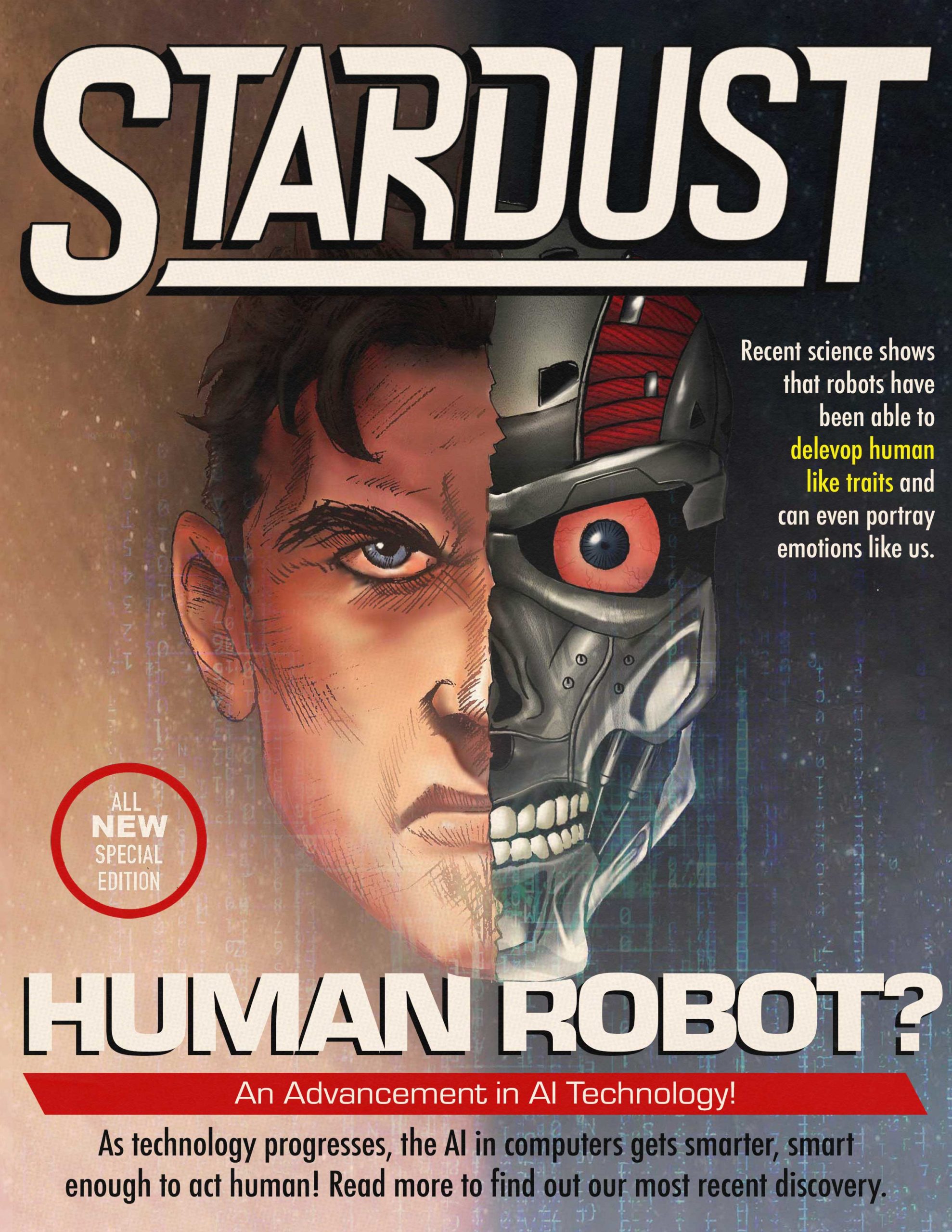
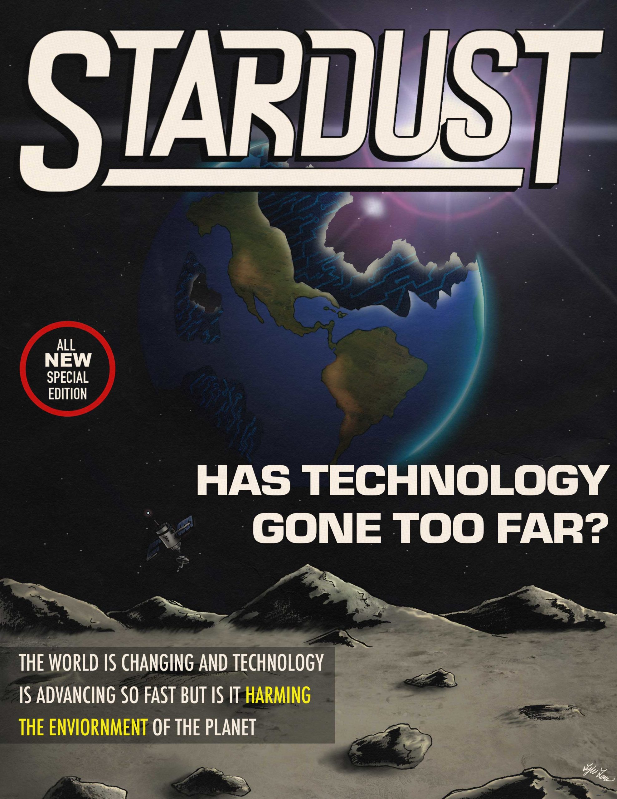
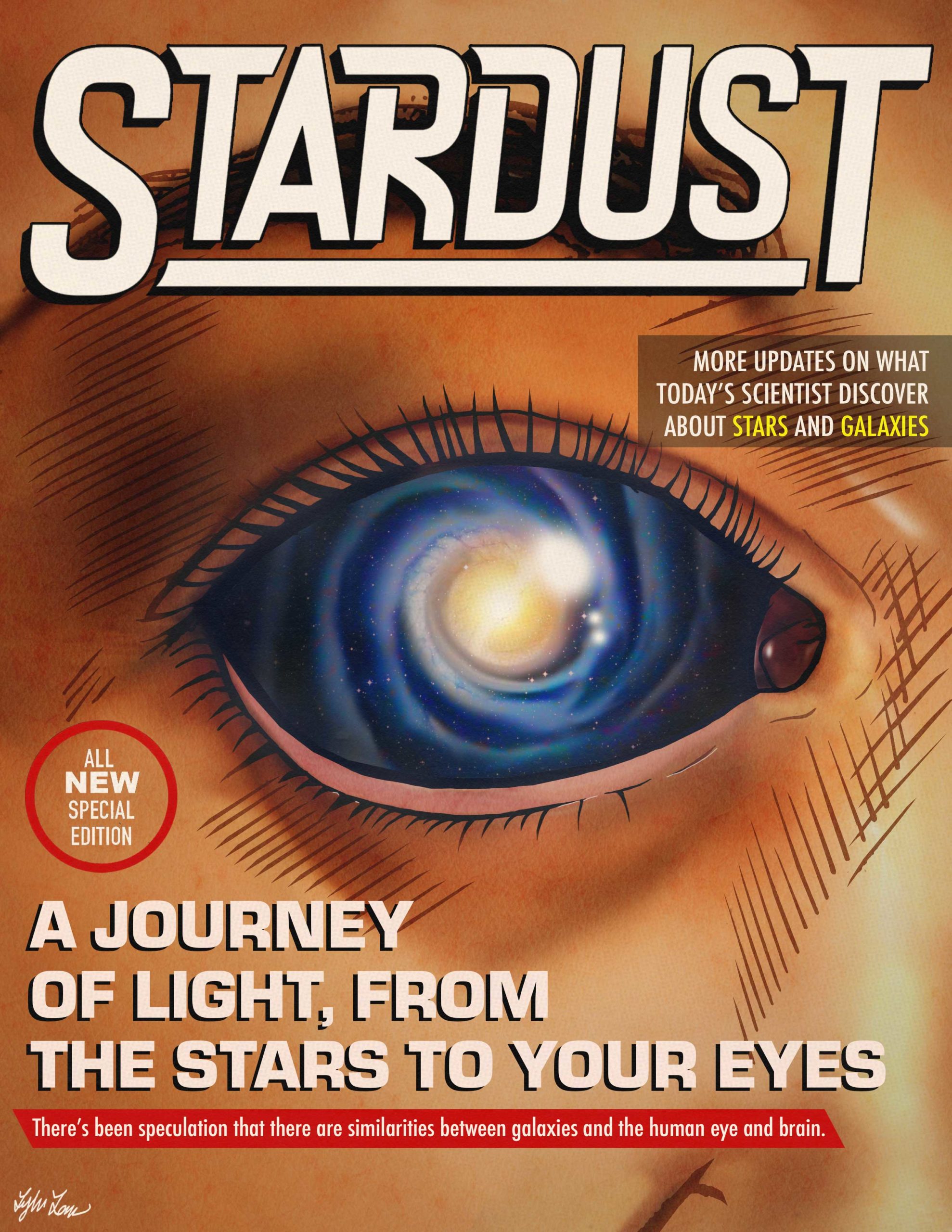
The goal of this project was to create eye-catching imagery for a science magazine. I’ve grown up always having an interest in outer space and the sci-fi genre and wanted to dedicate a project to that interest ever since I was little.
The contents of the magazine contain real-world news and events in the realm of science. The covers of the magazine are exaggerated illustrations of their respective headlines to get viewers’ attention and to showcase unique and intriguing artwork.
Category:
Cover Design
Illustration
Logo Design / Branding
Date:
05/07/20
View on:
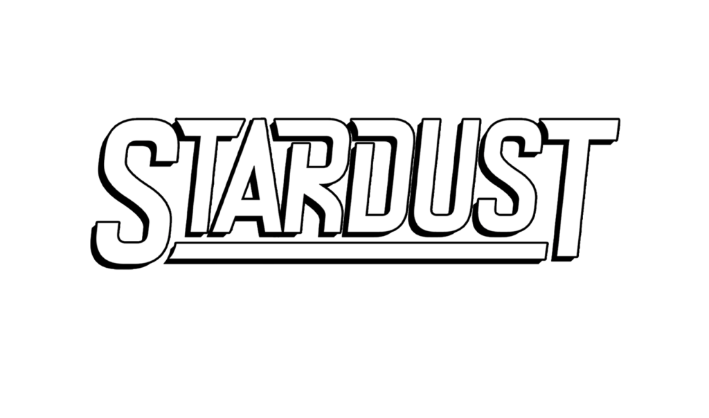

Logo
The logotype for the title was used with the typeface “Dealer Strikes” but slightly altered to bring the kerning of the type closer together and to adjust the sizing of the letters.
I based it on retro science fiction comic book covers with strong decorative text that popped out at the viewer. My take on the magazine title was used to create a sci-fi aesthetic that went along thematically and compositionally well with the illustrative covers for this project.


